 ML Designs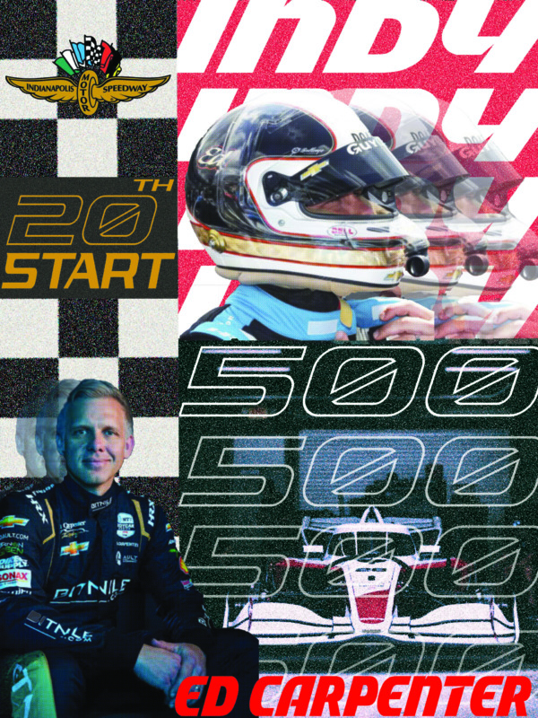
Original Project Goal
The goal of this project was to create a digital advertisement entirely in Photoshop for something that was personally meaningful or representative of who I am. I chose to focus on the Indianapolis 500, an event that holds a strong connection to my identity and where I grew up in Indiana. The Indy 500 is more than just a race, it is a major part of Indiana’s culture and one of the biggest events of the year.
Rather than creating a general advertisement for the Indy 500, I chose to focus on Ed Carpenter, an IndyCar driver who grew up in a neighboring town to mine. At the time of the project, Carpenter was preparing for his 20th Indianapolis 500 start, making it a significant milestone worth highlighting.
Choosing a local driver allowed me to make the project more personal while still connecting it to an event that represents where I come from. The concept gave me an opportunity to combine my interest in sports, Indiana culture, and graphic design into one piece.
Original Design
Original Design Details
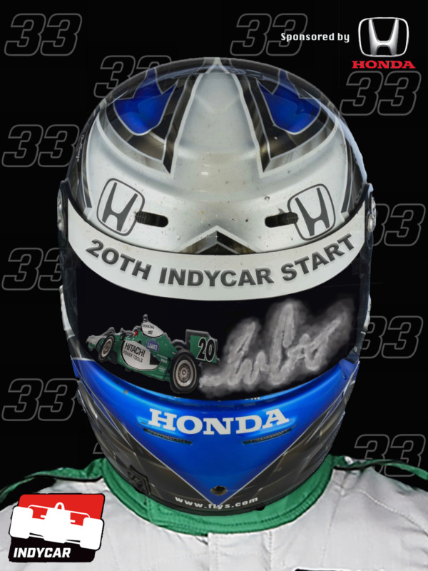
For the original advertisement, I wanted to make Ed Carpenter’s 20th IndyCar start the main focus while incorporating visual elements that immediately connect the piece to IndyCar and Honda.
The helmet serves as the primary focal point, allowing the viewer to immediately connect the advertisement to the driver and the sport. I incorporated the #33 throughout the background as a subtle repeating graphic element, creating visual texture while reinforcing Carpenter’s identity. The #20 and car imagery highlight the significance of his 20th Indy 500 start and create a connection between his career and the milestone being celebrated. I also only used images that were from his first Indy500 start.
The use of a dark background with bright blue and white elements creates strong contrast and allows the helmet to stand out. I also incorporated the Honda sponsorship and IndyCar branding to make the advertisement feel connected to the professional racing environment rather than simply being a portrait of the driver. I also wanted the car exhaust in the helmet to spell out his signature to add a little more detail to the piece.
Revamp Project Details
For this project, we were asked to look back at one of our previous creations and redesign it using the skills and knowledge we had developed since creating the original. I chose to revisit my IndyCar advertisement because it was one of the first projects I had ever created using Photoshop.
At the time, this was my first semester using Photoshop, so I was still learning the fundamentals of digital design, image manipulation, composition, and layering. After continuing to design and gaining more experience, I felt that I had developed the skills necessary to take the original concept much further.
The redesign gave me the opportunity to see my growth as a designer firsthand. I was able to approach the piece with a stronger understanding of composition, visual hierarchy, Photoshop techniques, and how to create a more cohesive and meaningful advertisement. Rather than simply recreating the original, I wanted to take what I had learned over the years and create a version that better represented the significance of the subject.
Revamp Design Details
For the redesign, I wanted to move away from the simpler, more straightforward composition of my original advertisement and create something that felt more energetic and reflective of the speed and intensity of IndyCar racing.
I used the Indianapolis Motor Speedway logo and checkered flag pattern to immediately establish the connection to the Indy 500. The large “20th Start” becomes an important visual element, highlighting the milestone that originally inspired the project. I also incorporated multiple images of Ed Carpenter, his car, and racing imagery to show both the driver and his career rather than focusing on a single moment.
The repeated “500” typography creates movement throughout the composition and connects directly to the Indianapolis 500. The layered images and overlapping elements were intentional, giving the advertisement a sense of motion, history, and progression.
Compared with my original design, this version allowed me to take more creative risks and use Photoshop techniques I had developed since my first semester. The redesign became less about simply advertising Ed Carpenter and more about telling the story of his career and celebrating the significance of reaching 20 Indy 500 starts.