 ML Designs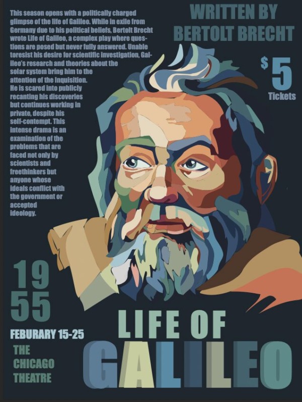
Project Goal
The goal of this project was to create a theatrical poster for Galileo that effectively communicated the play while incorporating all essential event information. The final poster needed to include the play title, dates, description, location, cost, and a single image, while maintaining a clear and engaging visual hierarchy.
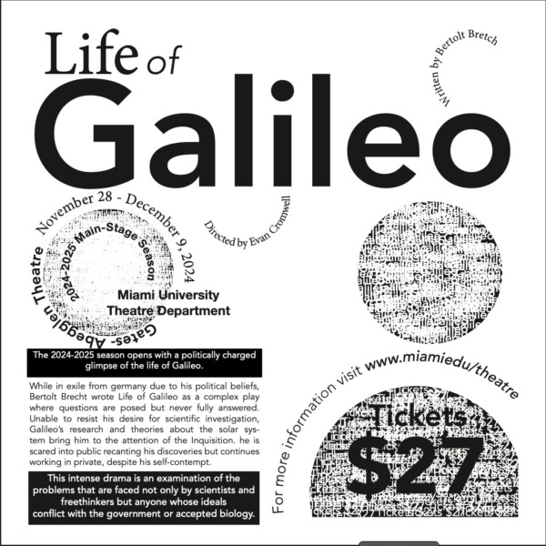
The project began with a typography-only exploration, challenging me to communicate the themes and tone of Galileo through type alone. From there, the project evolved into incorporating one image as the primary visual element while using typography and hierarchy to guide the viewer through the information.
A major focus was determining which information was most important to the audience and using scale, placement, and typography to establish a clear order of importance. This required balancing the visual impact of the poster with the need to make practical event information easy to find and understand.
Typography Only Variation
Design Concept
For this poster, I wanted the design to visually communicate the intensity, complexity, and political tension surrounding Galileo’s story. The central portrait became the focal point of the composition, using an expressive, layered illustration style to capture Galileo’s character and the conflict surrounding his scientific discoveries.
The typography was treated as a major visual element rather than simply supporting information. A strong hierarchy was established by varying scale, weight, placement, and color. The oversized “1955” and “LIFE OF GALILEO” create immediate visual anchors, while smaller supporting text provides the play’s description and event details without competing with the primary information.
The limited color palette helps unify the illustration and typography while creating contrast against the dark background. The combination of muted blues, greens, creams, and warm oranges gives the poster an aged yet contemporary feeling, connecting the historical subject matter with a modern theatrical aesthetic.
Design Challenge
The main challenge was balancing a large amount of required information with a single image while maintaining a strong visual hierarchy. Because the project required the use of only one image, I had to make sure the illustration carried enough visual weight while still leaving room for the necessary event information.
This project taught me how to use typography as both communication and visual expression. Rather than treating the text as separate from the image, I used the type to become part of the overall composition and guide the viewer through the poster in a deliberate order.