 ML Designs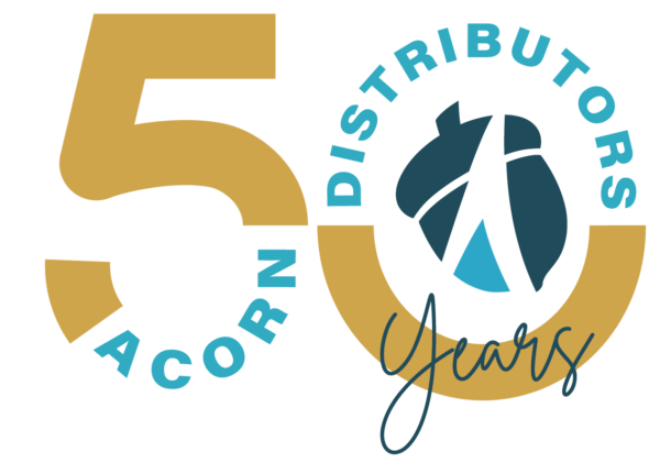
Project Goal
Design a commemorative 50th Anniversary logo for Acorn Distributors that celebrates the company’s history while representing its continued growth and future. The logo will serve as the official anniversary mark throughout the entire year and will be incorporated across company communications, marketing materials, social media, and other celebratory applications.
The design needed to feel distinctive and celebratory while remaining consistent with Acorn Distributors’ existing brand identity. The primary color requirement was the incorporation of gold alongside Acorn’s established brand colors, creating a visual connection between the company’s everyday identity and the significance of its 50-year milestone.
With the brand colors and gold serving as the primary constraints, I was given creative freedom to develop a concept that visually captured 50 years of Acorn Distributors’ history, relationships, and growth.
Logo Variation
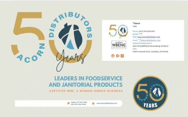
Logo in Use
Design Decisions
Designed to celebrate 50 years of Acorn Distributors, this anniversary mark combines the company’s existing brand identity with a bold, celebratory aesthetic. The gold “50” establishes the milestone as the focal point, while the Acorn logo anchors the design in the company’s identity. Circular typography creates movement and unity, while the handwritten “Years” adds a personal, celebratory touch. The final concept was developed through multiple design variations and rounds of refinement in consultation with Acorn’s 50th Anniversary Board, ensuring the mark represented the company and resonated across departments. Together, these elements create a versatile anniversary identity designed to represent Acorn throughout its year-long celebration.
50 — The primary focal point and visual representation of the milestone.
Gold — Represents achievement, celebration, and 50 years of success.
Acorn Logo — Keeps the anniversary mark connected to the company’s established identity.
Circular Typography — Creates movement while giving the logo a commemorative badge feel.
Handwritten “Years” — Adds personality, energy, and a human element to the design.
Brand Colors — Maintains consistency and ensures the anniversary logo feels authentically Acorn.
Challenge
One of the biggest challenges of this project was bringing together the perspectives of an entire 50th Anniversary Board and reaching a final design that everyone could support. With representatives from different departments, each person brought their own ideas, preferences, and vision for what the anniversary logo should communicate.
A particular challenge was interpreting feedback from individuals without a design background. Not everyone had the design vocabulary or visual experience to clearly describe what they wanted to see changed or how they envisioned the final result. This required me to look beyond the literal feedback and understand the idea or feeling behind what they were communicating.
Through multiple rounds of revisions and conversations with the board, I learned how to translate non-designers’ ideas into visual solutions while still applying my own design knowledge and maintaining a cohesive identity. This experience strengthened my ability to listen, ask the right questions, interpret abstract feedback, and turn someone else’s vision into a tangible design.
The biggest takeaway was learning that being a designer isn’t just about creating but it is also about listening, interpreting, and finding a visual solution that allows everyone to see their ideas represented.