 ML Designs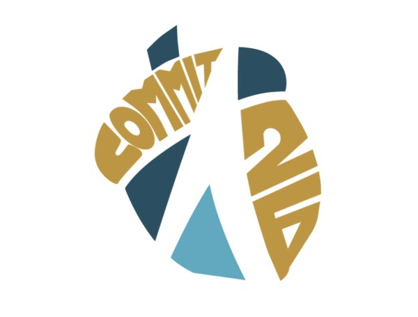
Project Goal
The goal of this project was to create a logo for Acorn Distributors’ sales team that represented their commitment and goals for the year. The sales manager selected the word “Commit” as the central message, representing the team’s commitment to customers, vendors, and the company.
The logo was introduced at the beginning of the year as part of the company’s 50th anniversary initiative, serving as a visual reminder of the team’s shared goal and the importance of staying committed throughout the year.
A key consideration was creating a mark that was simple, recognizable, and versatile. Since the logo needed to be used across a variety of applications, including stickers and other promotional materials, I focused on a minimal design that could remain clear and effective at different sizes and in different formats.
First Draft
Design Challenge and Learning Experience
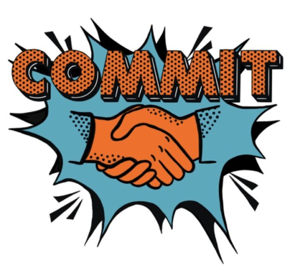
The first draft took a quirky, colorful approach that reflected previous design styles I had created for the sales manager. I initially designed the logo based on what I thought he would personally like, rather than considering what the entire sales team and company needed from the design.
After discussing the concept with him, I realized that I had approached the project from the wrong perspective. I wasn’t designing a logo for the sales manager, I was designing a logo to represent the sales team and their commitment to the company, customers, and vendors.
This became an important learning experience in understanding the difference between designing for an individual and designing for an audience or organization. I learned to step away from my assumptions, listen more carefully to the purpose behind a project, and consider who the design ultimately represents.
Design Concept
After revisiting the initial concept and focusing on the sales team and the company as a whole, I developed a more minimal and purposeful direction. The final logo uses Acorn’s established gold, dark blue, and light blue color palette to maintain a clear connection to the company’s identity.
The word “COMMIT” is integrated into the mark and positioned within a circular, forward-moving composition. The surrounding shapes create a sense of movement, momentum, and unity, reflecting the sales team’s commitment to moving forward together.
The simplified design also addresses the practical needs of the project. By reducing unnecessary detail and limiting the color palette, the logo can be easily adapted for stickers, apparel, print materials, digital graphics, and other applications while remaining recognizable at different sizes.
Most importantly, the final concept shifted my focus from designing based on an individual’s personal preferences to designing for the larger audience and purpose behind the project. The result is a mark that represents not just the word “Commit,” but the team’s commitment to Acorn, its customers, and its vendors.