 ML Designs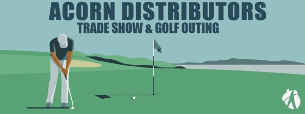
Project Goal
The goal of this project was to design a simple, highly visible banner for an annual golf outing and tradeshow that could be easily recognized by guests arriving at the golf clubhouse. The banner needed to clearly communicate where the event was located while also representing the company and the event itself.
Because the banner would be viewed primarily by people driving up to the clubhouse, visibility and quick communication were key considerations. I needed to limit the amount of text and create a design that could be understood within just a few seconds, using strong typography, clear hierarchy, and recognizable visual elements.
There were no specific design constraints, which gave me creative freedom to determine the most effective way to communicate the event while maintaining a professional representation of the company.
Design Concept
For the final banner, I focused on creating a design that could be understood quickly from a distance while immediately communicating both the company and the event. The large “Acorn Distributors” headline establishes the company first, followed by “Trade Show & Golf Outing” to clearly identify the event.
The golf course illustration creates an immediate visual connection to the outing without relying on additional words. I used a wide, simplified landscape to give the banner a strong sense of depth while keeping the composition clean and easy to read from a passing vehicle.
The large-scale typography and limited amount of information were intentional choices based on the banner’s environment. Rather than filling the space with details, I prioritized the information guests needed to recognize where they were and what event they were attending.
The Acorn logo is also incorporated into the design to maintain brand recognition while allowing the golf imagery to establish the event’s personality.